
So, as of late March 2013, we’d been working on Gone Home for a full year. Just today, Karla found a couple of screenshots from April 30, 2012– basically the very first rough draft of the house in its most basic form. It’s nearly April 30, 2013 now. Let’s see what a year of development looks like!
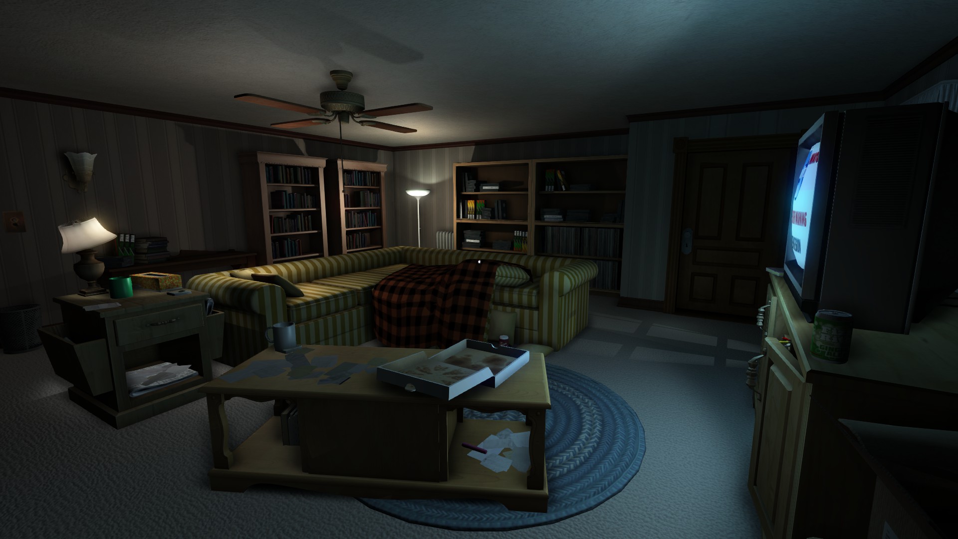
The TV room 2012 vs. 2013:

Sam’s bedroom 2012 vs. 2013:

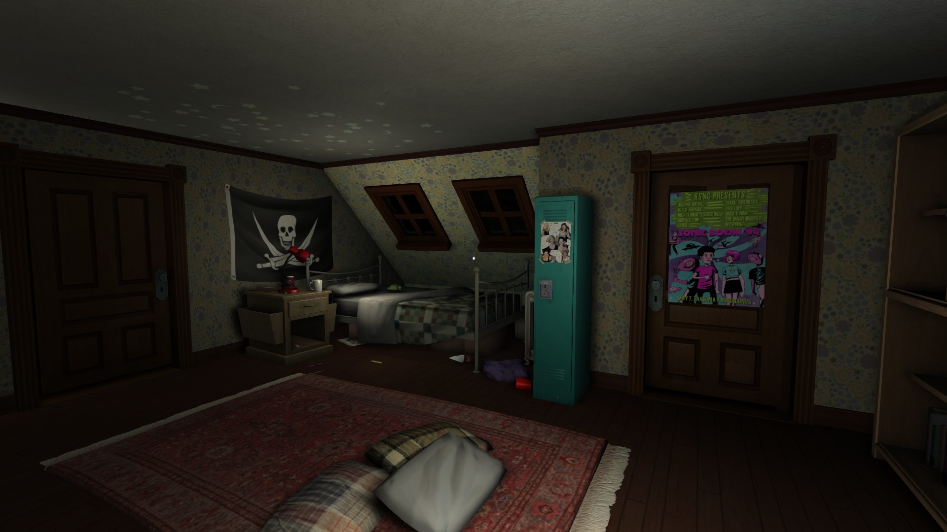
Stuff’s a lot less gray, for one! A few interesting notes:
The 2012 shots are from immediately after we started talking to Kate about working with us; she’d just sent her art test in and that little side table with the magazine holders on the sides was one of the very first meshes she sent in! It’s the one asset that’s consistent between the shots… we’re keeping it! When you ship assets that an artist submitted as their art test, you know they’re good. It wasn’t long after this that Kate joined the team full-time.
Aside from that, it’s kind of surprising how stable the layouts of the rooms and the placement of relevant objects has stayed. The shapes of the rooms, placement of the doors and important furniture, windows and so on is basically the same. You can even see the edge of the pillows on the floor of Sam’s room in the 2012 shot!
That said though, the proportions of the rooms have changed a LOT. The rooms have gotten a lot more cozy since last year. It’s kind of absurd seeing how orphaned the furniture looks in those early shots. On the one hand it’s always easier to scale a room properly when you have all the art assets that will be populating it onhand, which we didn’t last April, but also, as the level designer, I was coming off of almost four years of working on BioShock games, which have much larger proportions and higher ceilings, to allow for FPS gameplay. Takes some time to unlearn that muscle memory…
But it does kind of highlight part of our process, which is that we came up with a plan early on, and have stuck to it and just tried to produce that idea instead of making big sweeping changes. Which, as a small, self-funded team, is important for actually getting a project done in a timely fashion. I’m glad that the Greenbriar house looks both so recognizable and so very different one year on.

Wow, that’s an incredible jump. The new environments feel so much more real and lived in, but still carry a definite sense of loneliness.
This looks sooooo good. Love the moody new shots and it’s great to see the development. Can’t wait for this game!
The new screenshots have a lot more details and color in them!! And it actually has a cozy, comfy look to it which can make the emptiness in the house so much more emotional. Great job!!! 😀
Dang, that’s some major progress in a year. Those assets look great.
Is Sam’s bedroom final? It looks a tiny bit empty, I think.
It’s like you guys made this game for me!! I can NOT wait to get my hands on this game!!!